

Solution
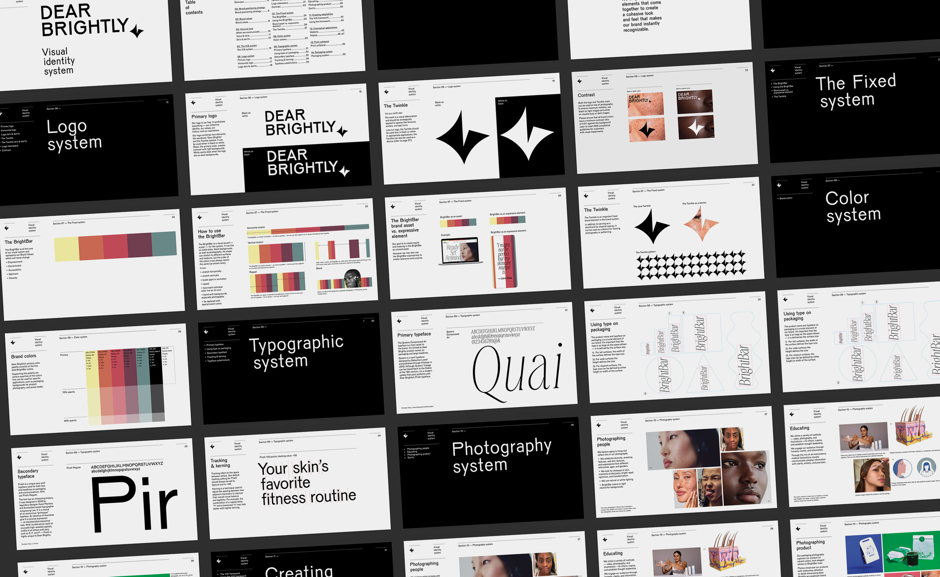
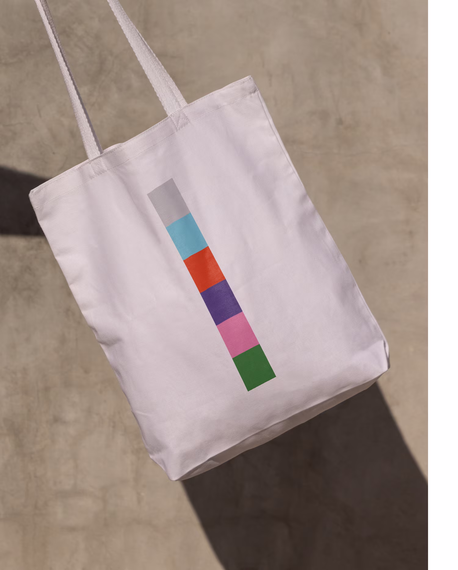
Using our 70/20/10 framework, we created a new visual identity design system that gives the brand the flexibility needed to change and adapt while building equity and trust over time.The first step was to develop core creative assets - the fixed assets that would remain constant while building brand equity.
But to create the flexibility the brand needs, the next step was to design the system’s flexible assets. These assets enable the brand to create relevance without risking its brand equity. The last step was to create space for the brand to evolve and innovate. This is actually the beauty of the framework. 70 of the assets are designed to build brand equity, 20 build brand relevance and 10 for innovation.
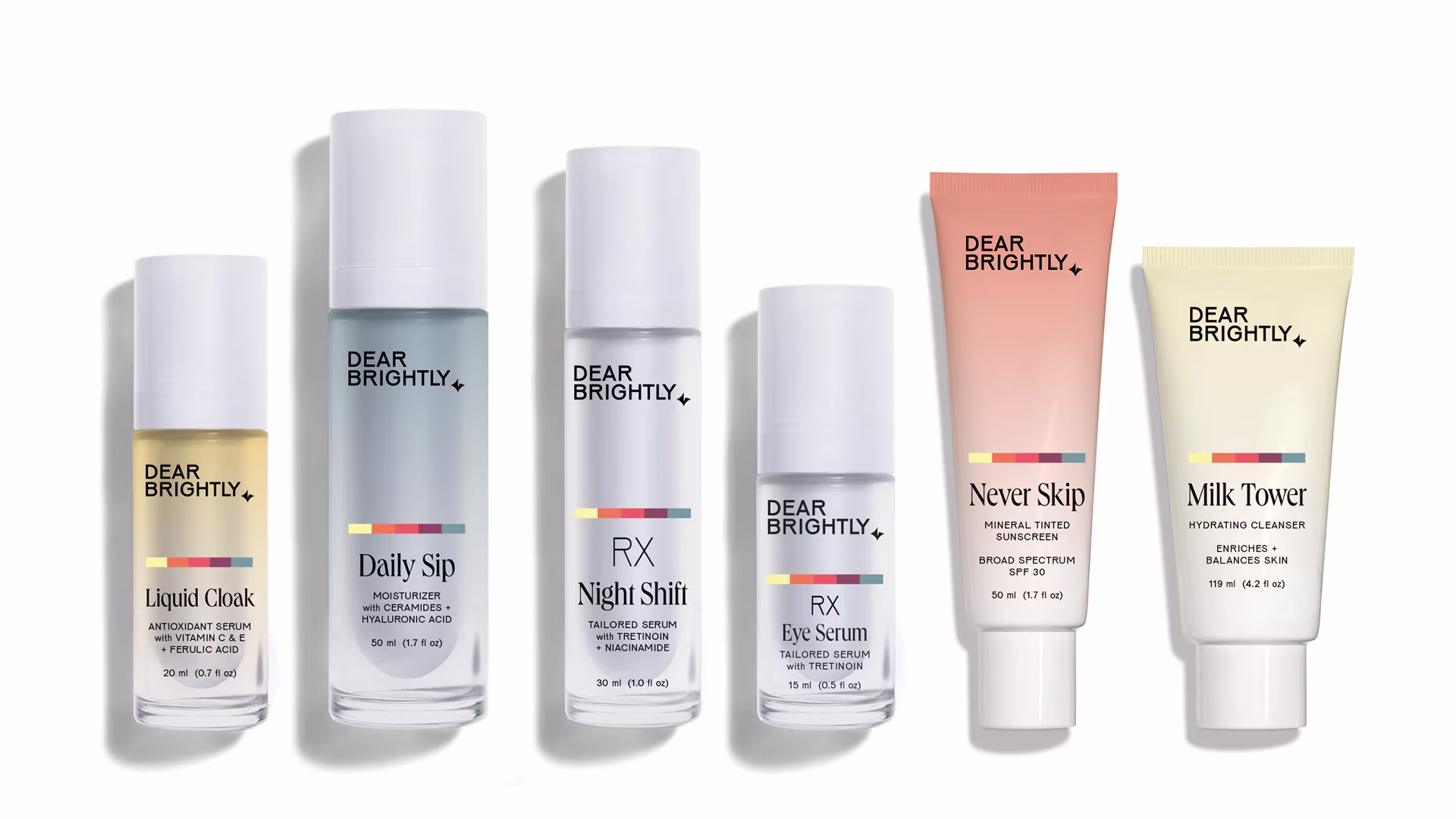

There was an incredible opportunity in the marketplace to get retinoids into more consumers hands. We created Dear Brightly to bridge the gap between dermatologists and everyday people.
Amy Chiu, co-founder.
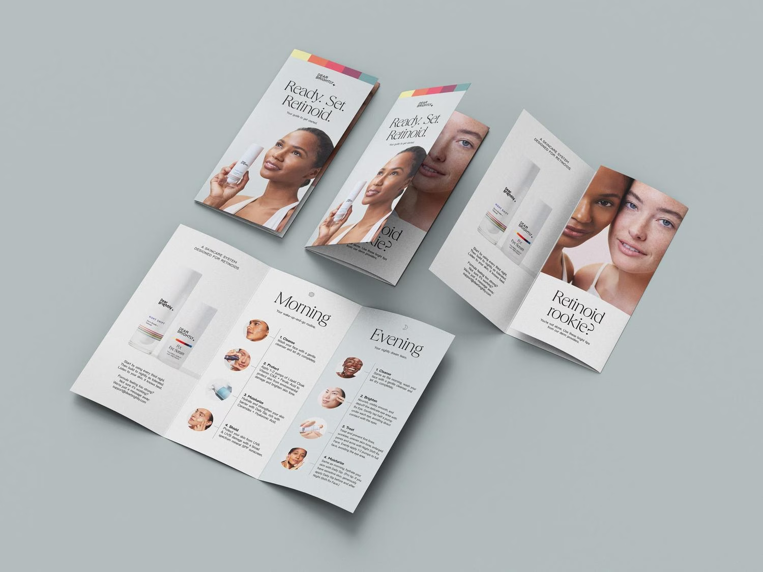
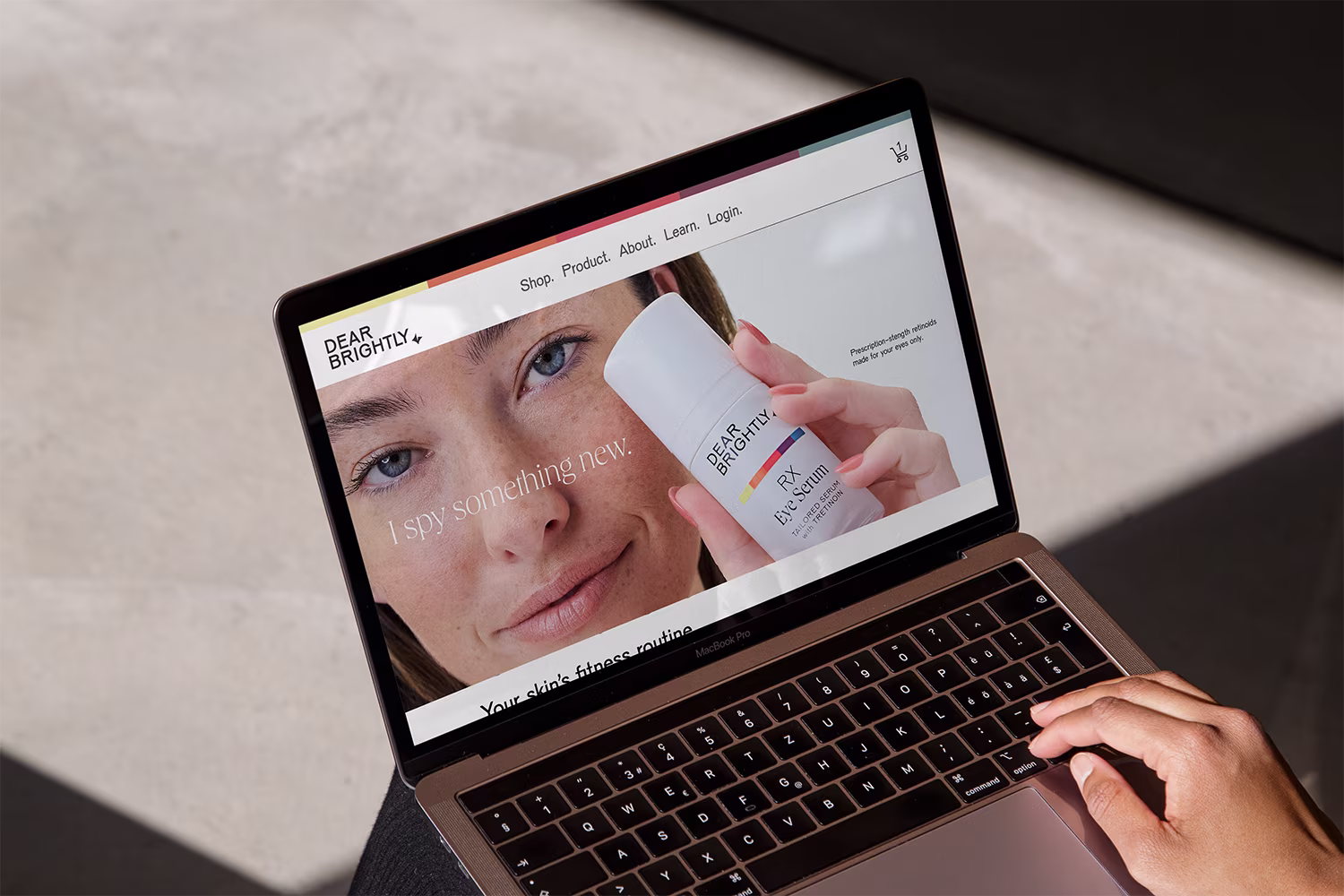
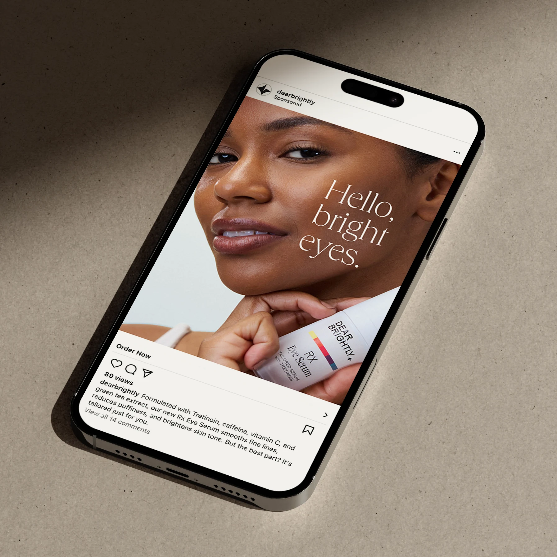
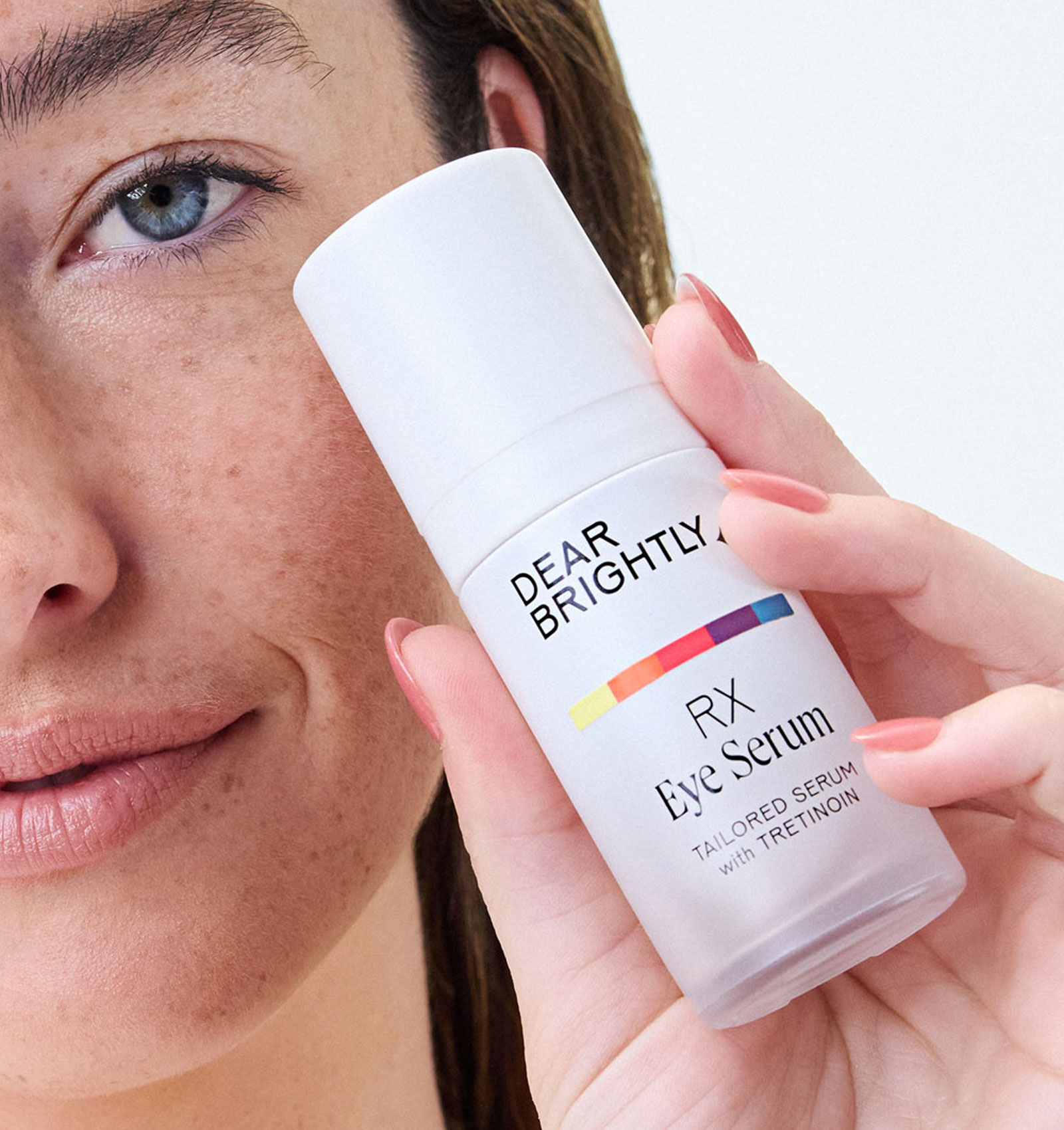
Creative Director Elise Mattingly then worked with SoWhat to further develop the system, leading creative strategy, messaging, packaging design, and creative across social, digital, and OOH, including the launch of the RX Eye Serum.