
Challenge
United Way of Greater Atlanta, UWGA, holds the distinction of being the largest United Way organization in the nation. UWGA believes that a community’s health can be measured by the wellbeing of its children and have developed cutting edge research to identify specific opportunities at a granular level.
UWGA then plays a unique role in harnessing the collective power of community resources, time, talent, and funding, to address complex issues such as homelessness, high school dropout rates, and childhood hunger.
However, a significant challenge existed. UWGA was struggling to connect more effectively with the changeing needs of its key audiences and adapting to new technology platforms. That’s where SoWhat came in.

Solution
We developed a three-pronged approach to address their challenge.
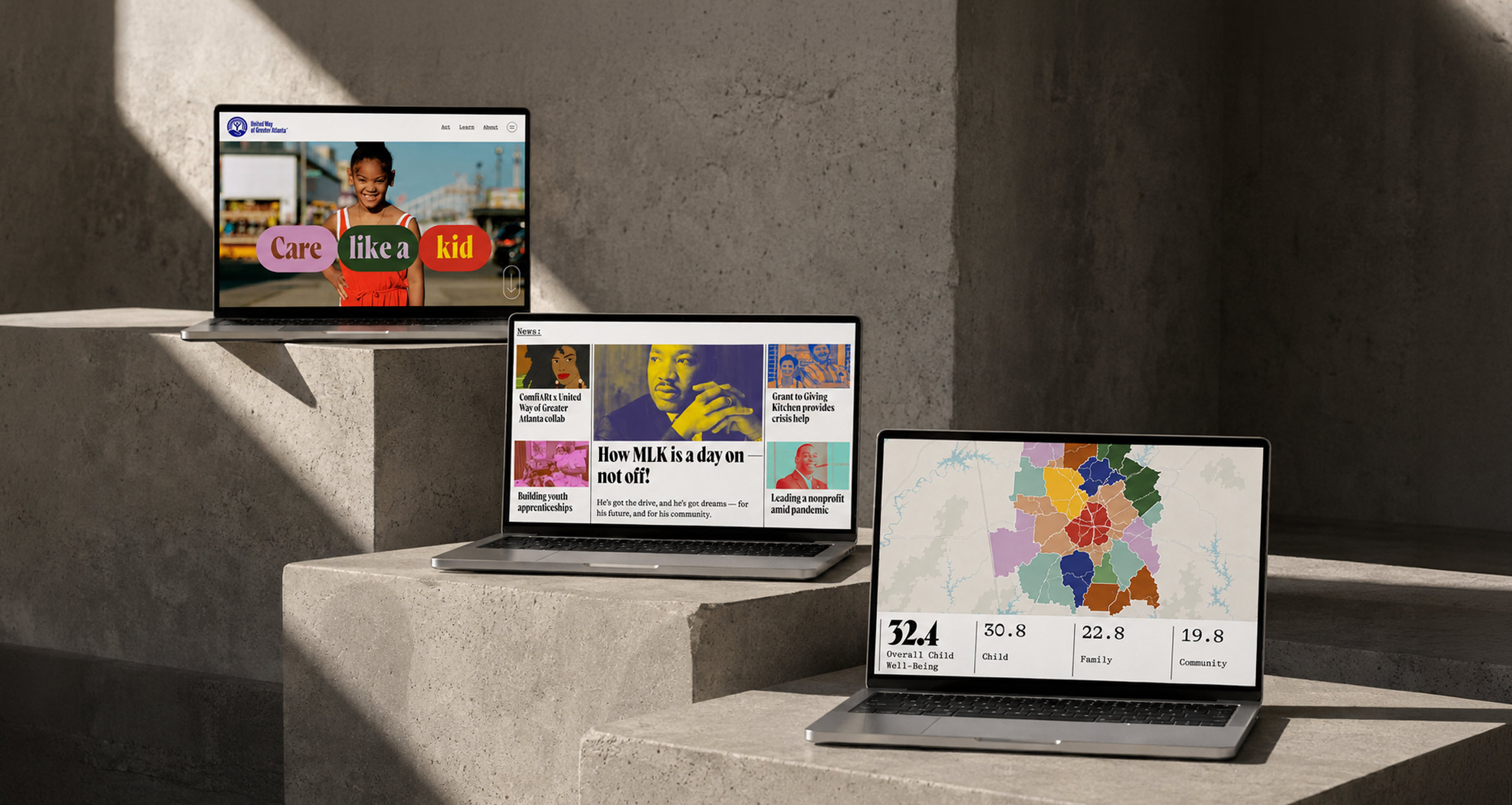
We designed a new, adaptable branding system, created a new awareness-building campaign, and redesigned the website, their primary channel for communication, giving, and connecting with the community.
The website strategy aimed to establish not only a strong emotional connection with the audience but also to adopt a fresh, content-first editorial approach to showcase UWGA’s significant efforts in promoting child well-being and driving conversions.
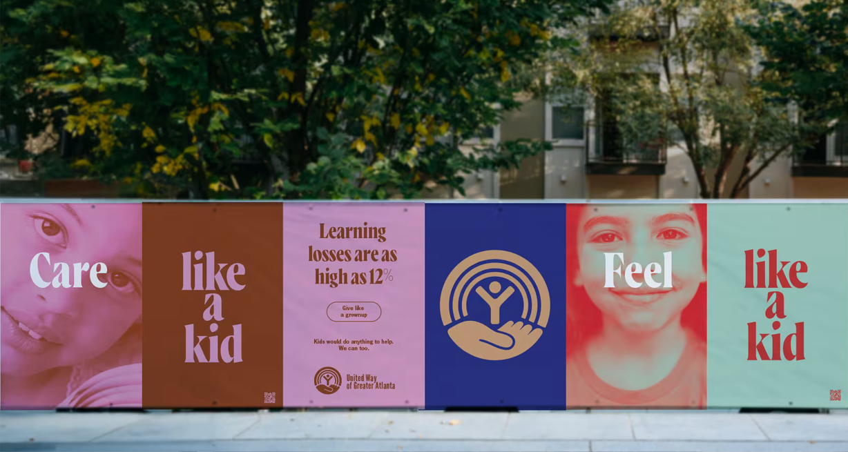
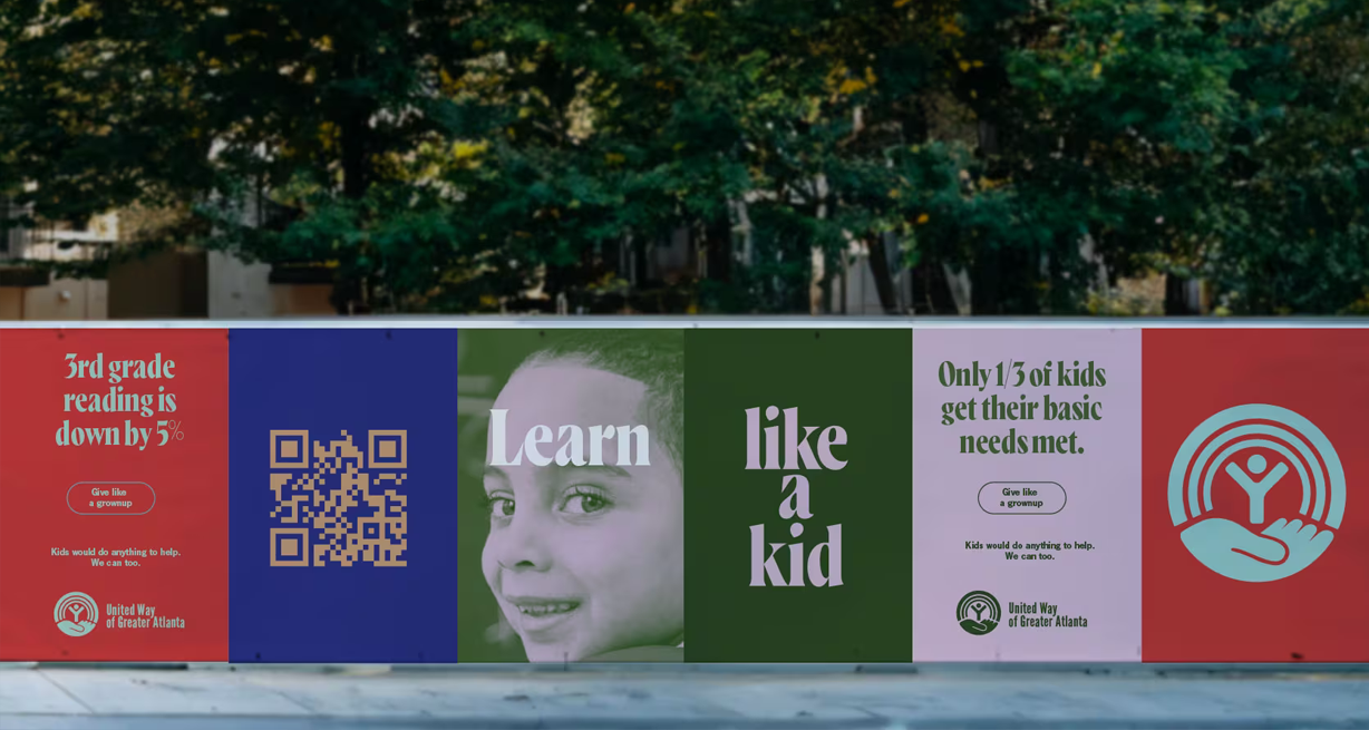
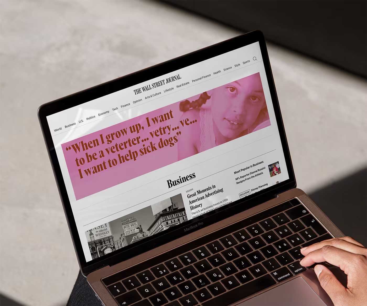
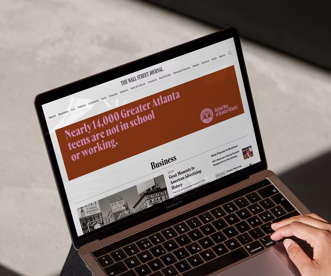
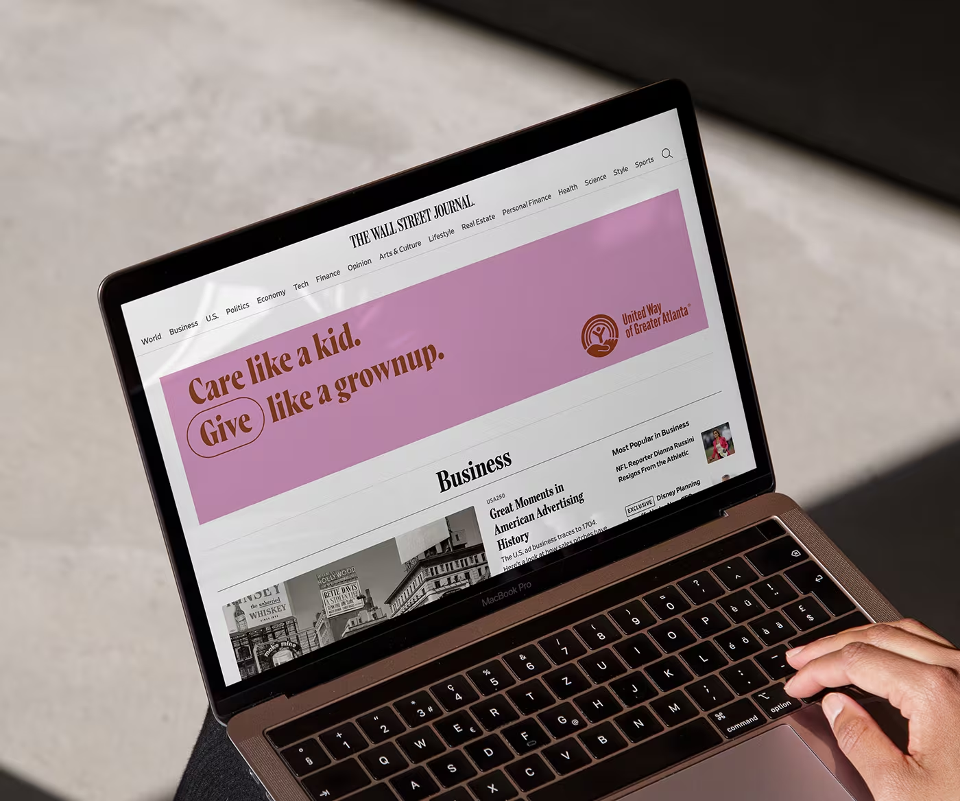
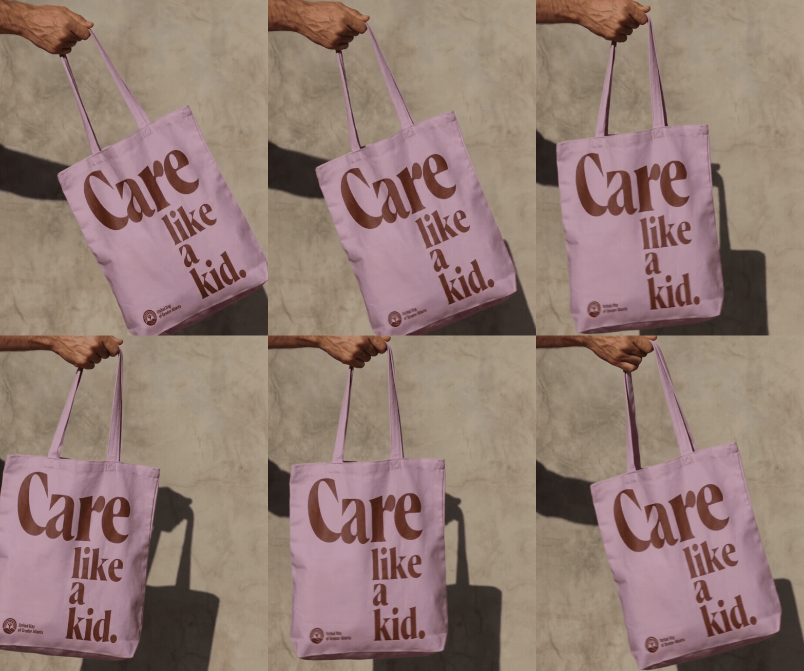
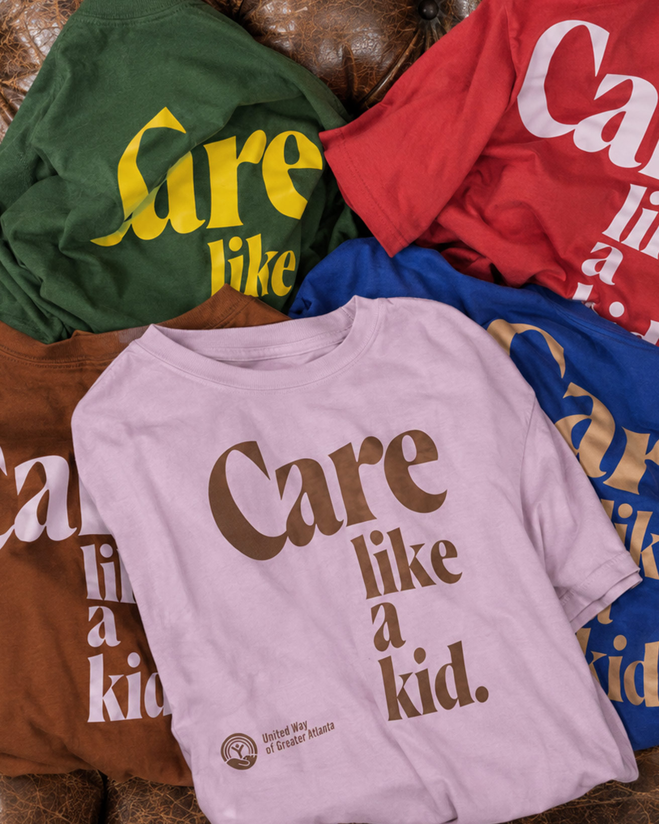
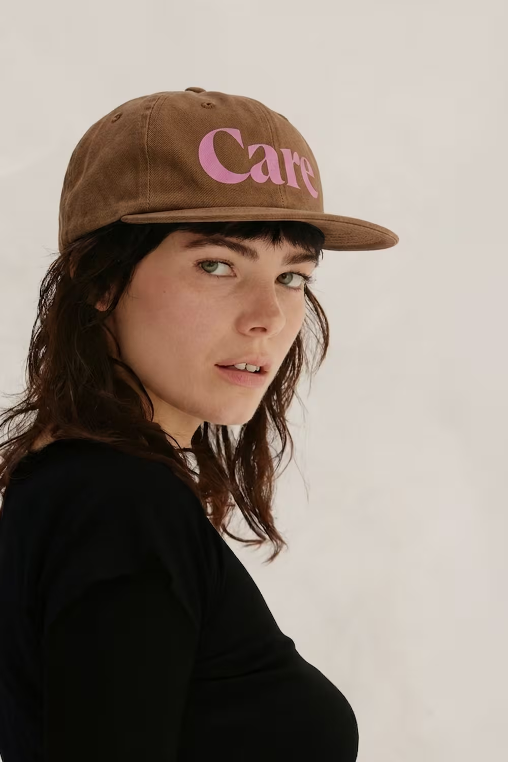
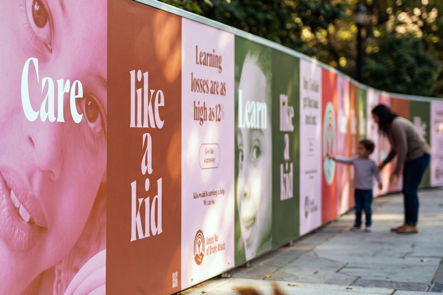
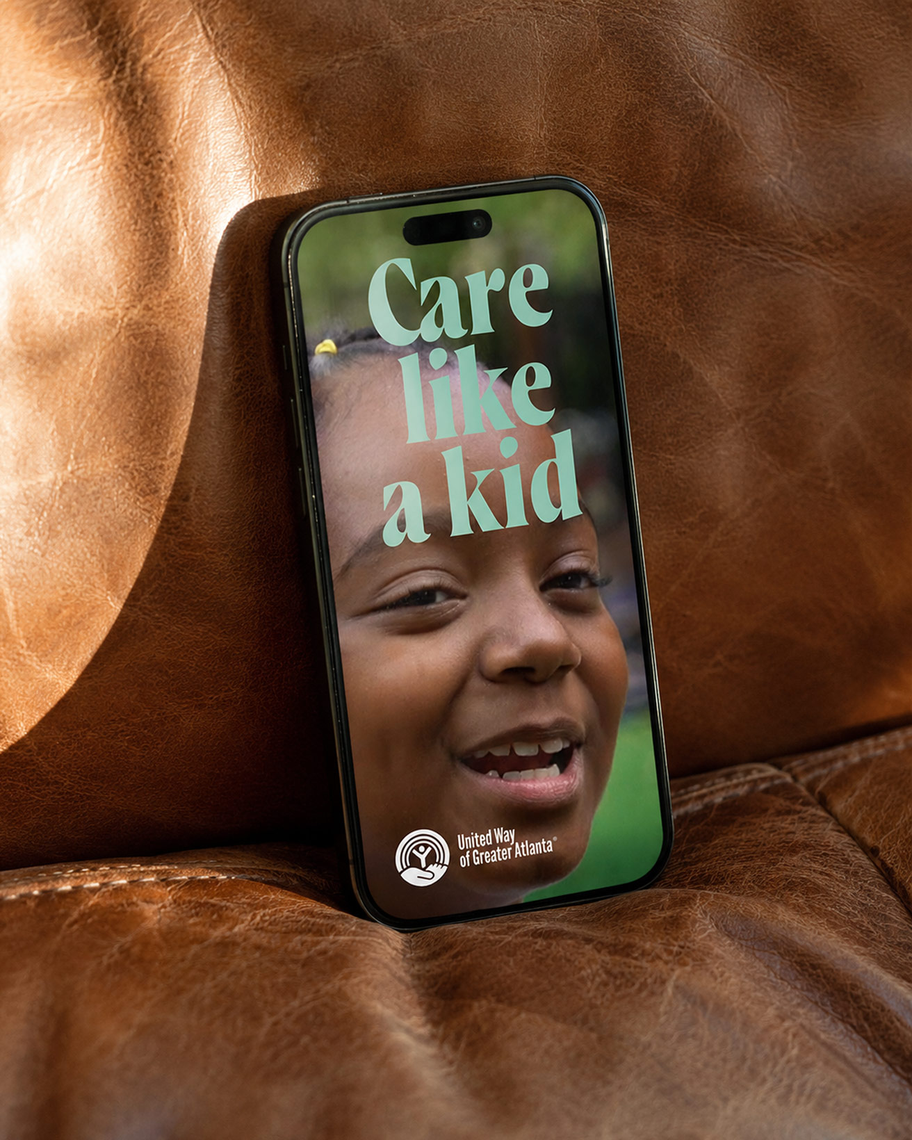
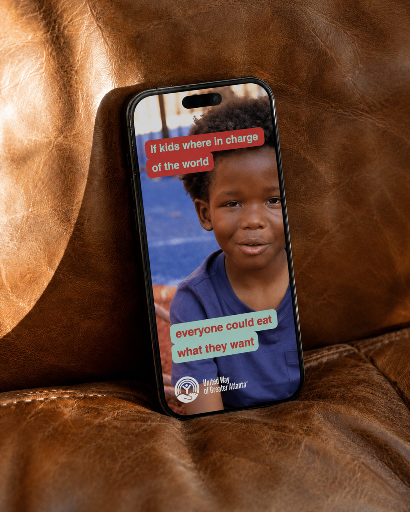
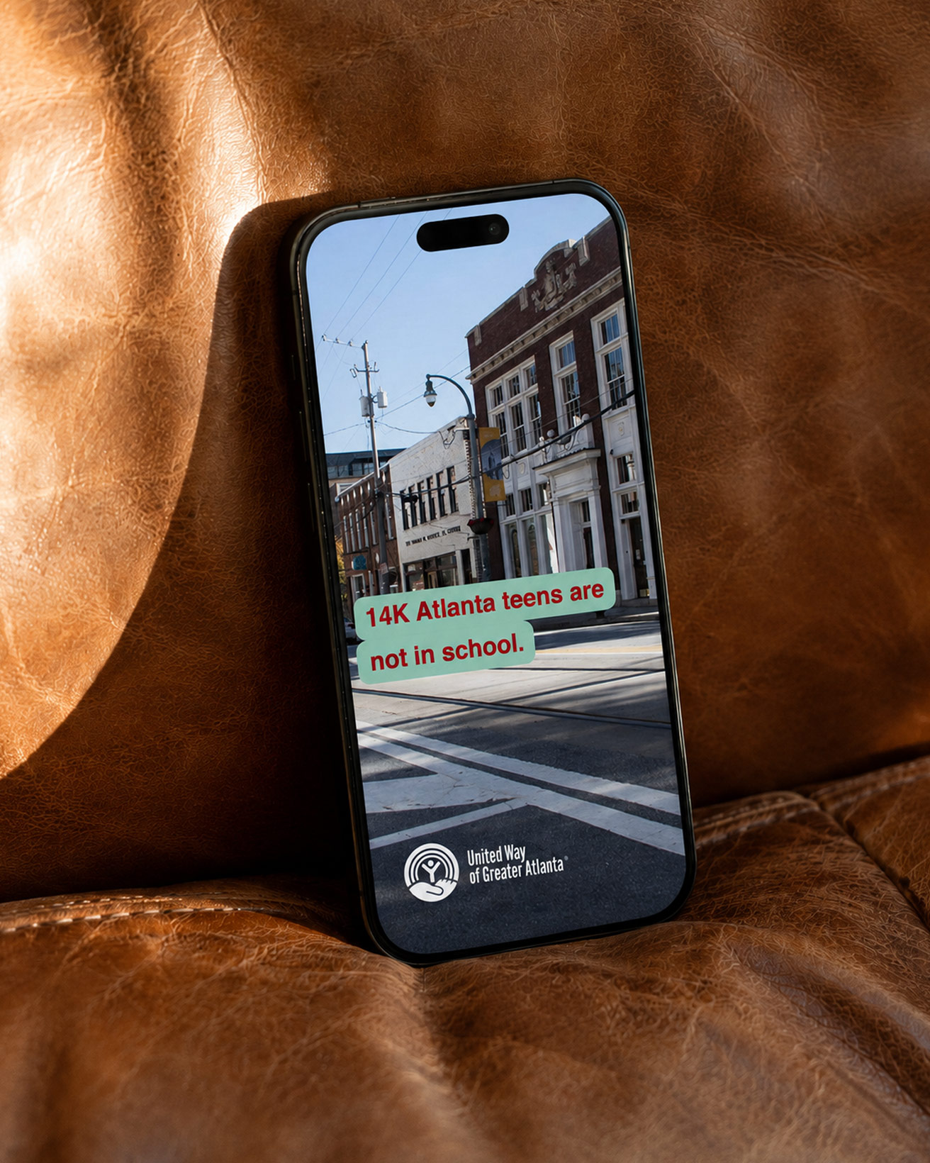
The new campaign uses a very simple yet effective device to encourage everyone to care like a kid, but to give like a grownup. Care has the flexibility to be changed to almost any verb, and Grownup can represent any entity, depending on the specific target audience or partner throughout the campaign.
UWGA has seen a sustained 3x increase in clickthrough rates compared to its previous campaign.
We are honored to have played even a small role in helping UWGA make a tangible difference in people’s lives.
‘We’ve been helping improve the well-being of children, families and communities for more than a century, but we needed a way to tell our story in a relevant way in today’s world. SoWhat did exactly that. We couldn’t be prouder of the work.’
Milton Little - President, United Way of Greater Atlanta
The previous logo had become overly complex and required simplification and modernization. This involved the development of a vibrant, dynamic color system that forms the basis for the new Child Well-Being campaign.