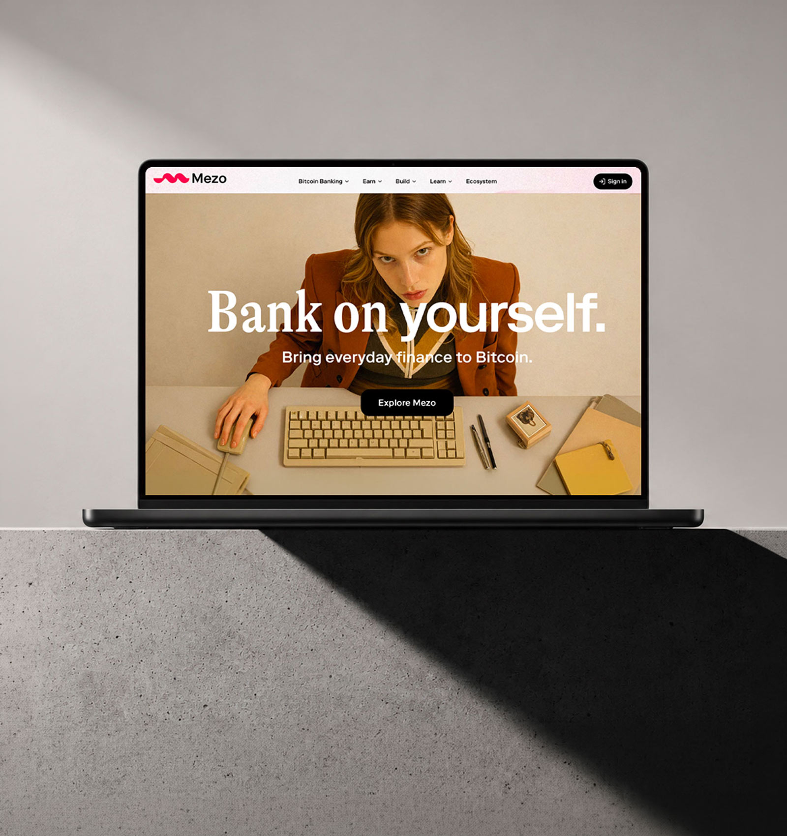

Challenge
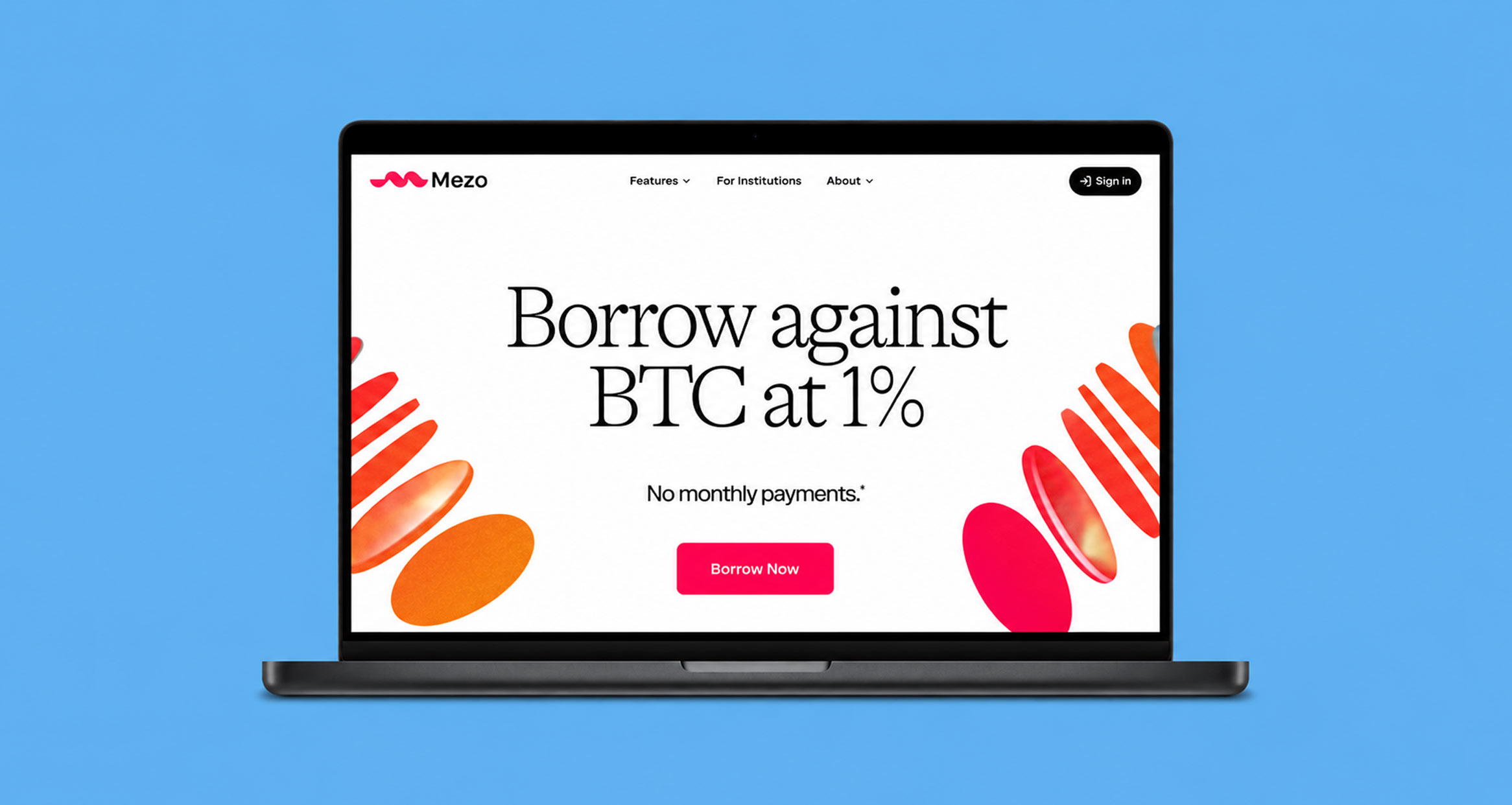
Thesis saw an opportunity to bring Bitcoin into everyday life. Mezo was created to make that possible.
The ambition: make paying with Bitcoin feel as easy as buying a coffee with your phone, while opening the door to major purchases, like buying a home without a traditional loan.
More than 15 years after Bitcoin was introduced, it is still easier to own than to use. For many people, it remains complicated, unfamiliar, and disconnected from daily life.
That set the brand challenge for Mezo: make Bitcoin feel simple, useful, and trustworthy in a category still largely defined by the technology.

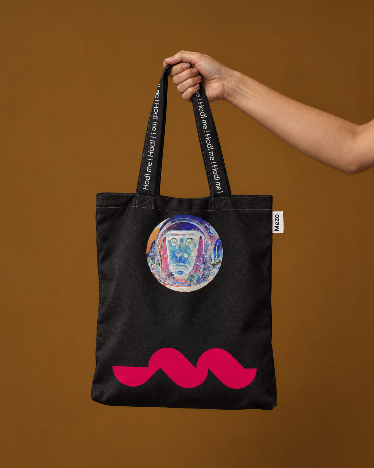
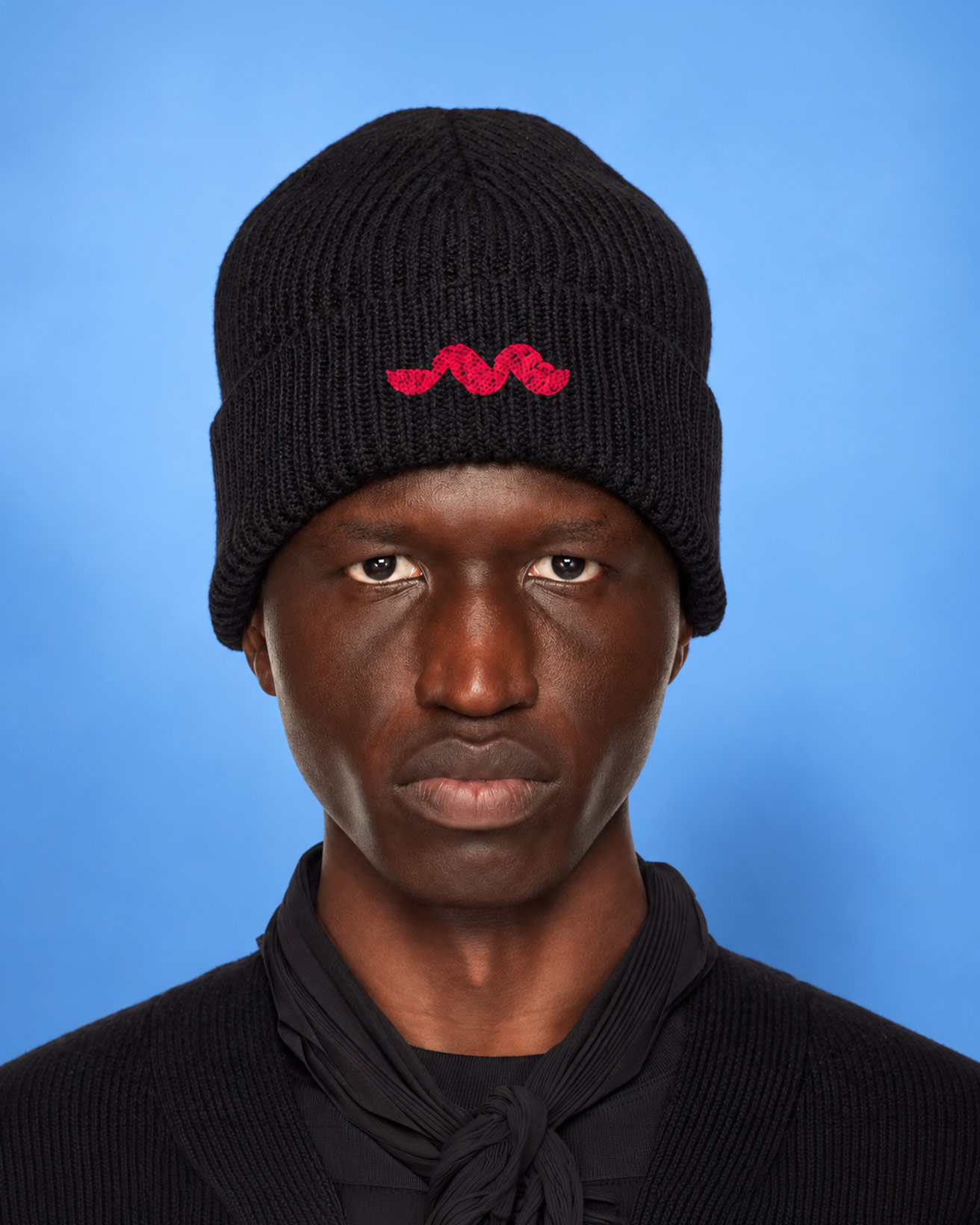

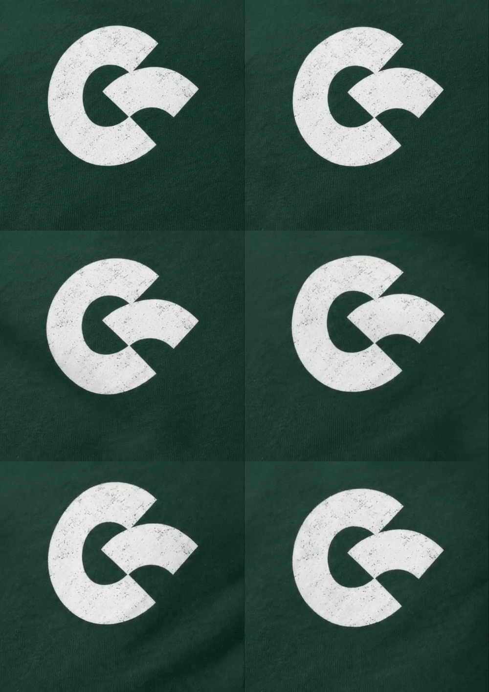
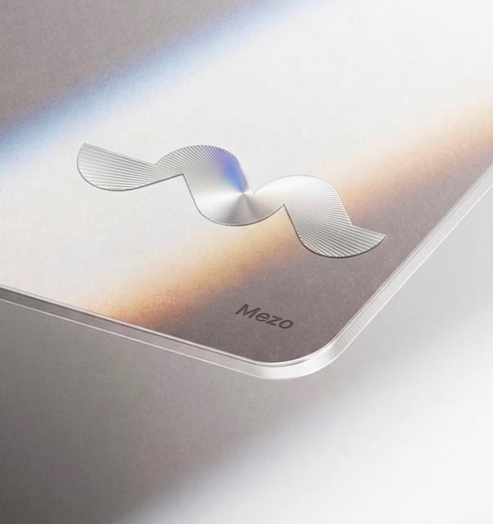
The logo was modeled after the Mesopotamian writing system known as cuneiform, one of the earliest forms of writing.
The brand reveal video, produced in collaboration with motion studio Fern.
Solution
Our approach was based on three ways to design trust into brands.
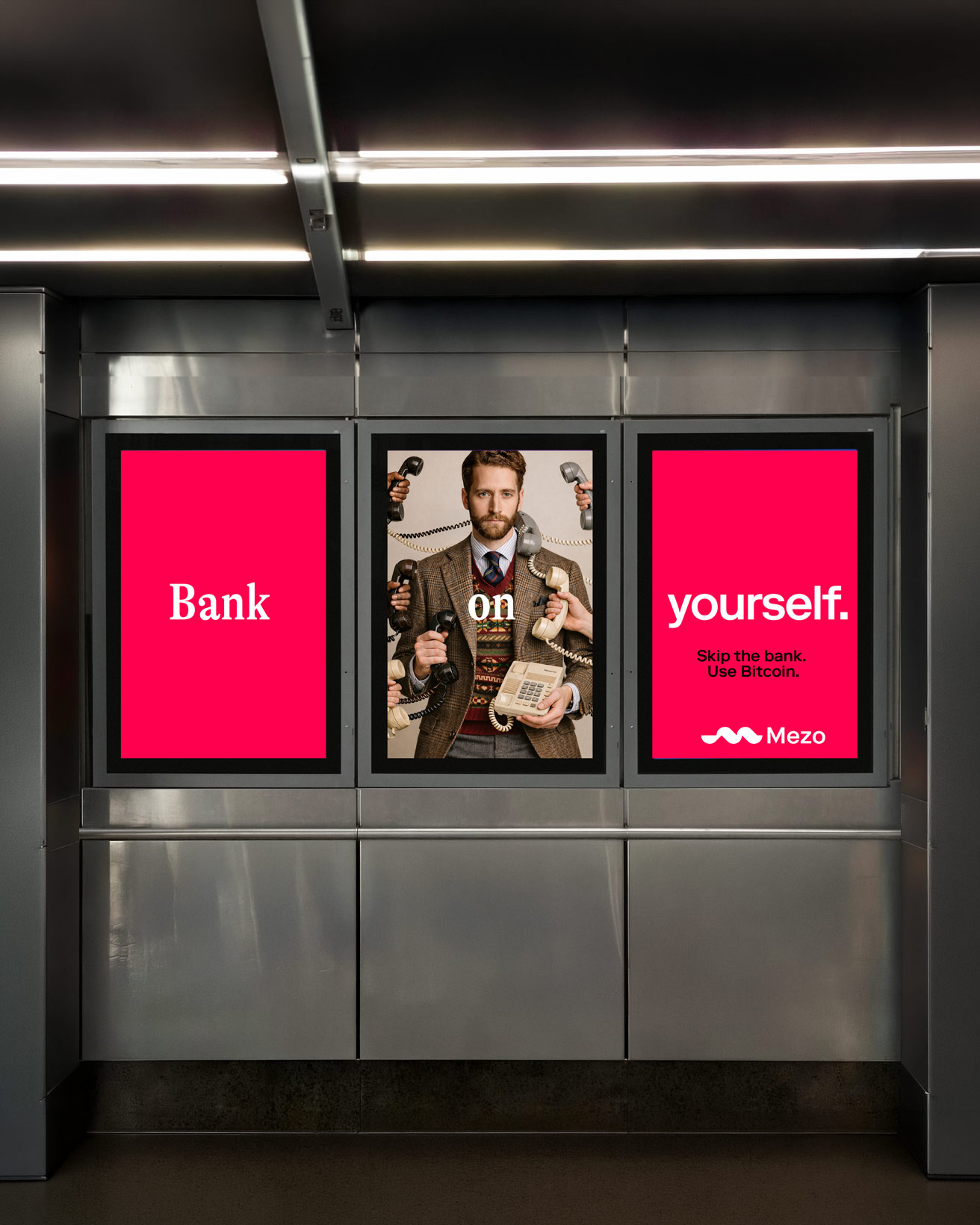
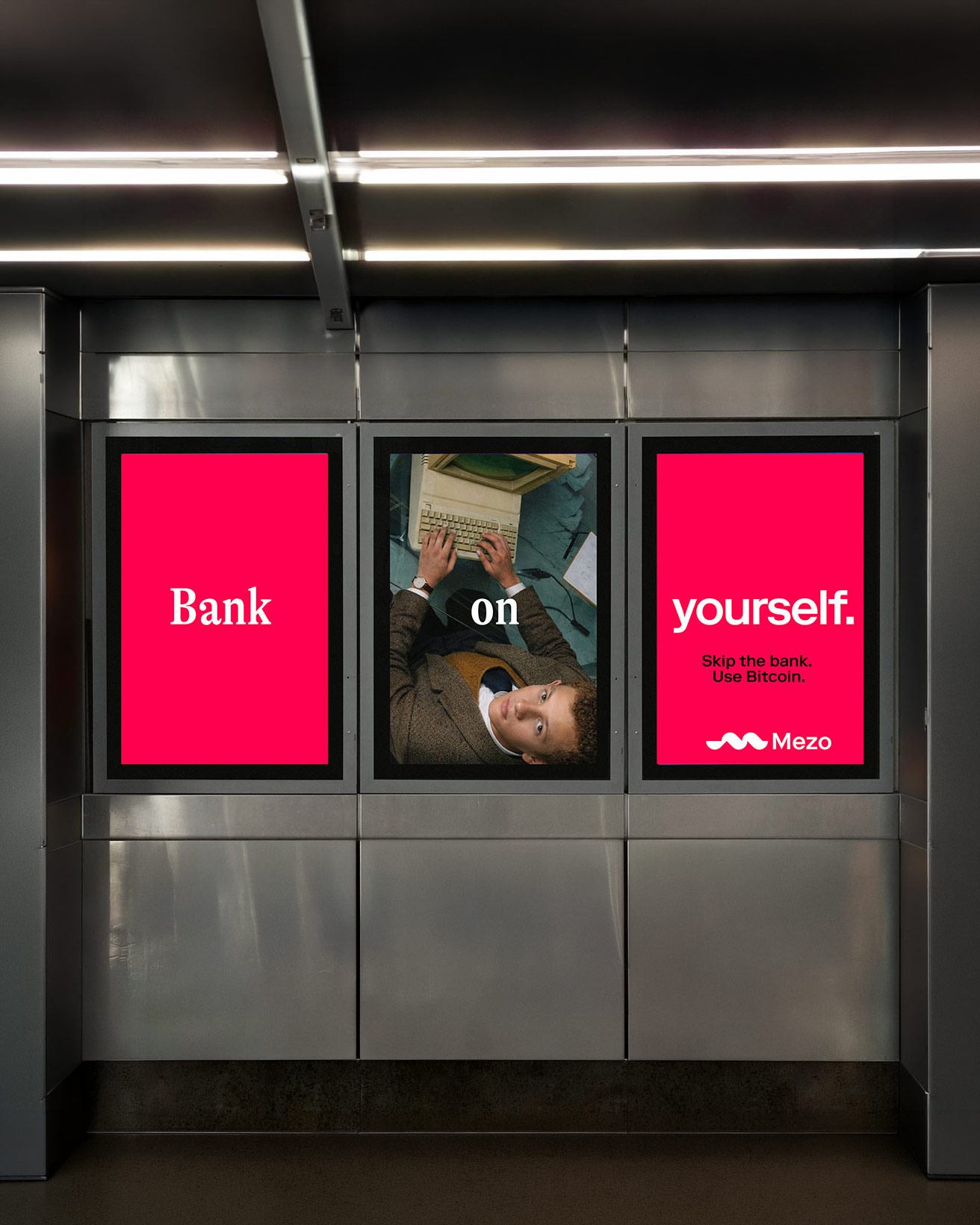
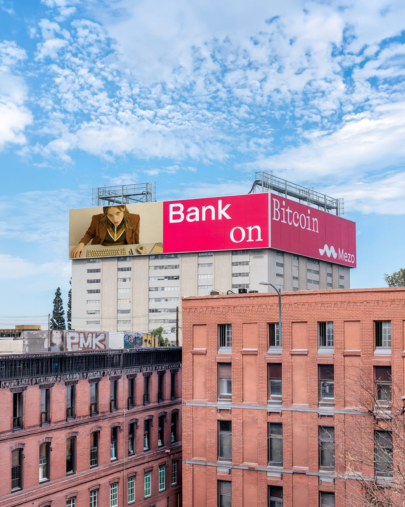
1. Use imagery and refrences that are unique yet people feel comfortable with.
2. Create an adaptable branding system to create consistency across every touch point with the brand.
3. Enable as much authenticity possible, especially in the beginning.
The Mezo name is based on Mesopotamia, the cradle of human civilization. Drawing inspiration from this heritage, we blended it with modern circular economy concepts, while still embracing the ’crypto-punk’ aesthetic.
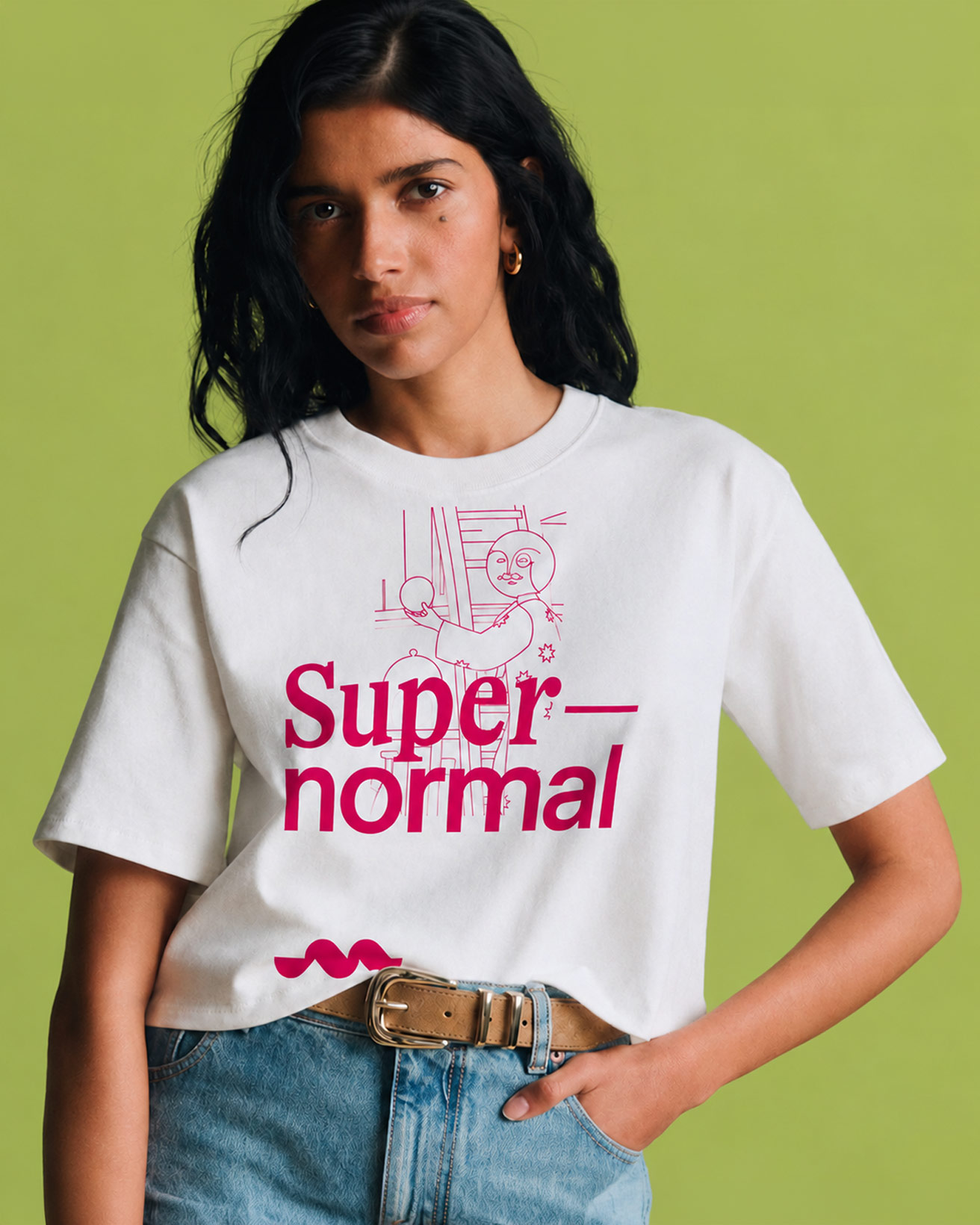
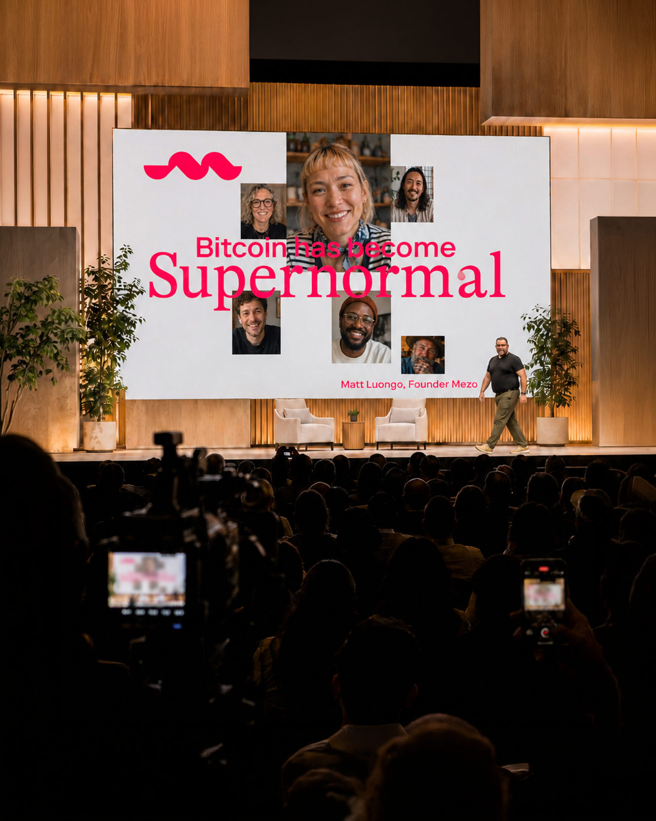
This fusion became the bedrock of Mezo’s brand: smart, irreverent, and open enough for people to play with. And they did. The community turned the logo into memes, remixes, and posts of their own. For a new brand, that’s a powerful signal. People weren’t just noticing Mezo. They were making it theirs.
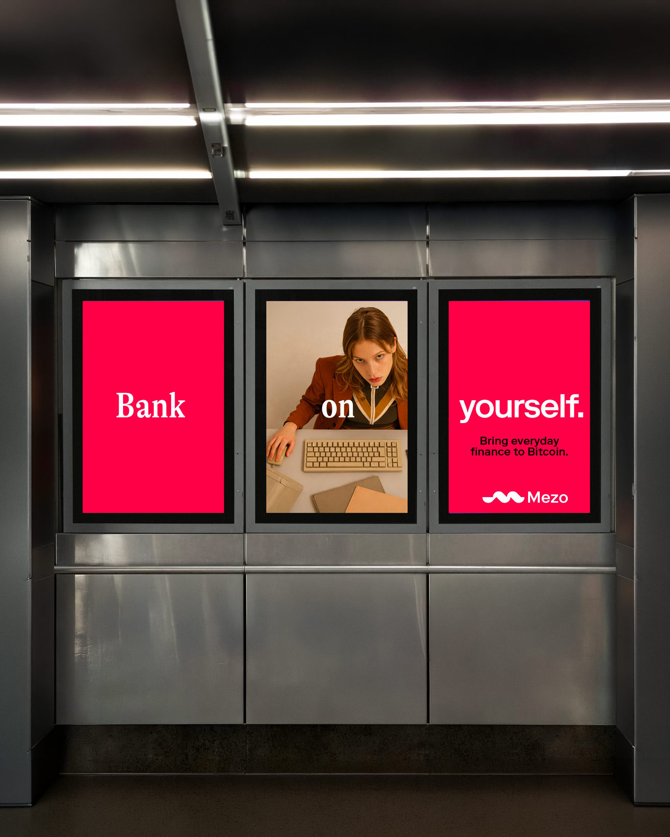
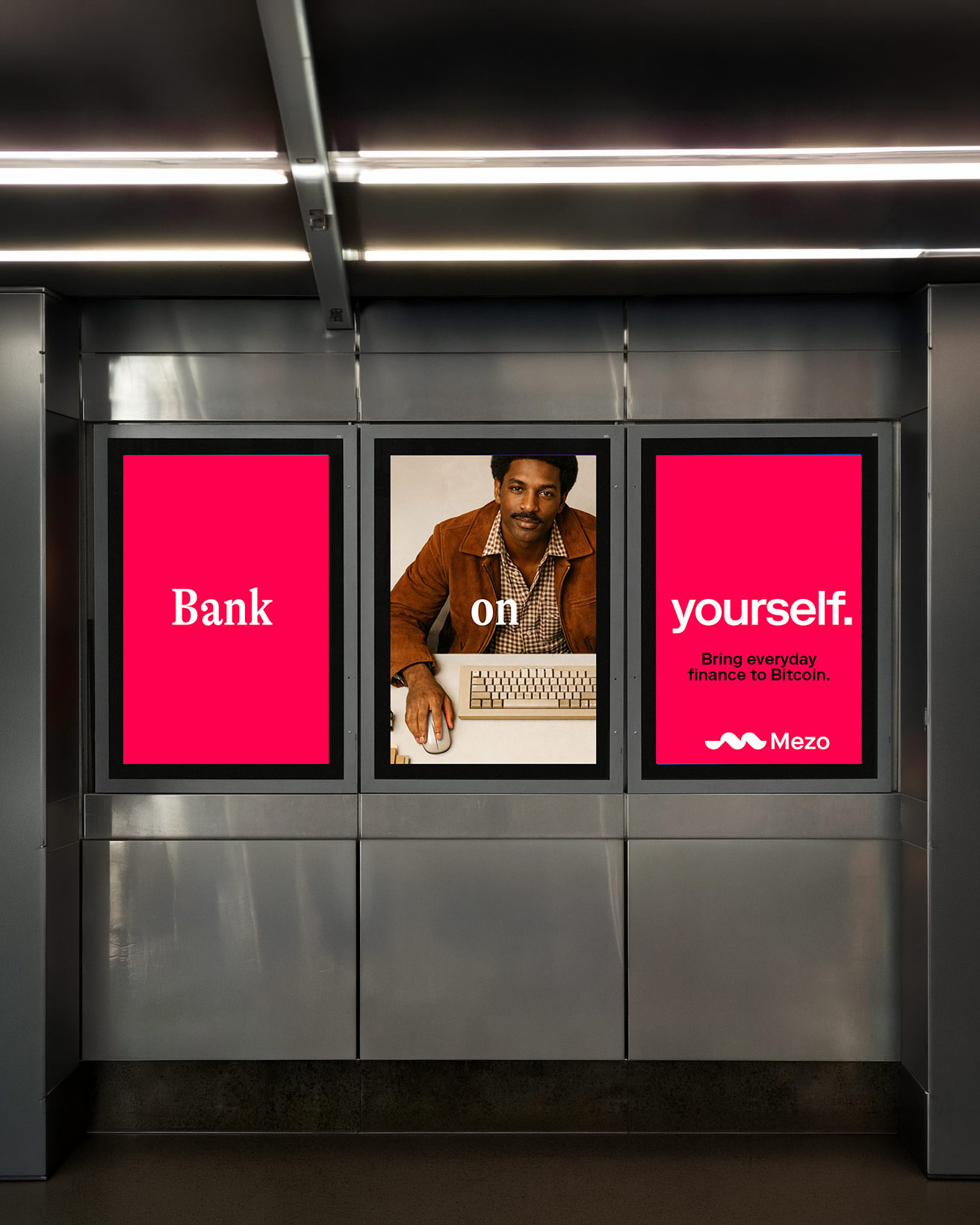

Our goal with Mezo is to bring 25% of the world’s economy on-chain.
Matt Luongo
CEO of Thesis and founder of Mezo